Profiscience
Transforming Processes, Achieving Results.
Sector
Consulting
Deliverables
Art direction
Brand strategy
Naming
Visual identity
About
Profiscience is a quality-management consultancy that turns complex processes into simple, tailored solutions. Focused on the healthcare sector, it helps organizations achieve operational excellence and regulatory compliance with less complexity.
The challenge
One of the main challenges in developing Profiscience’s visual identity was ensuring that the symbol and color palette accurately reflected the brand’s essence: professional yet approachable.
The concept
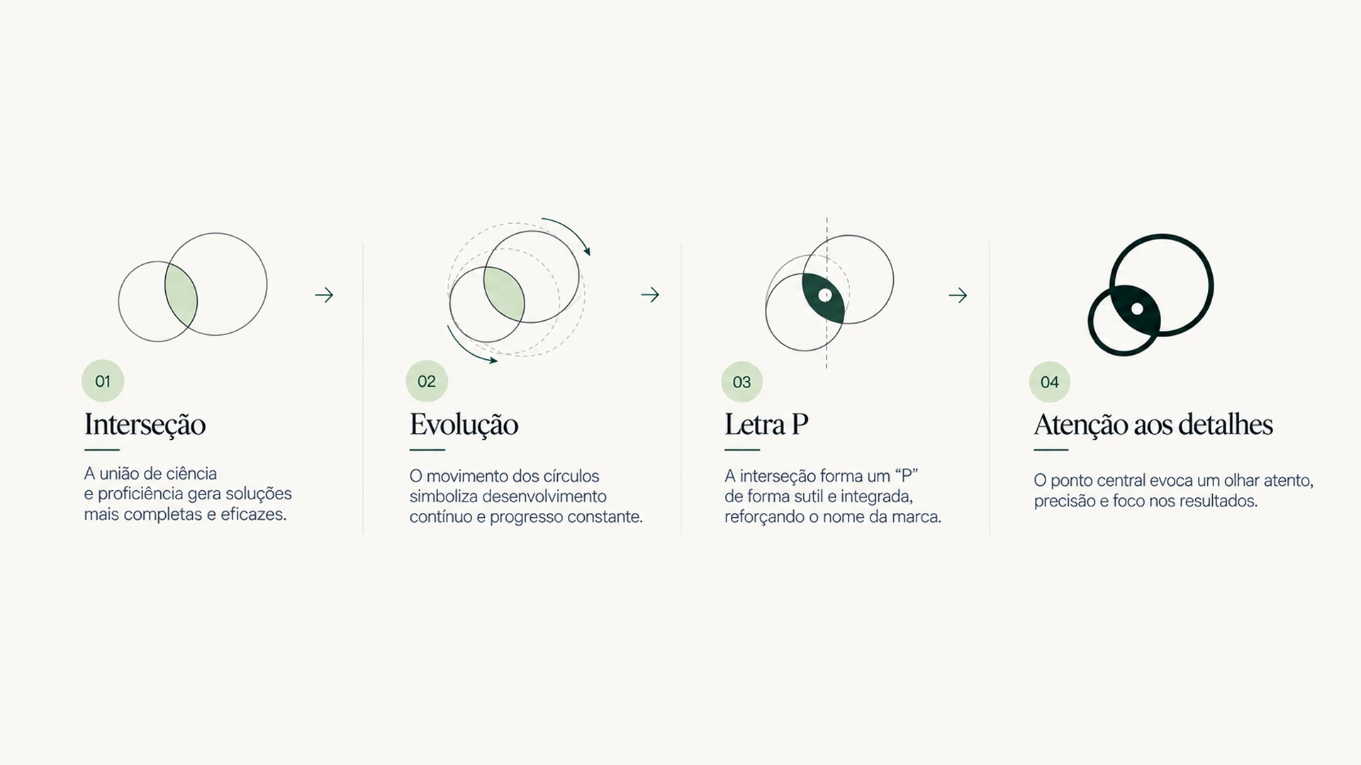
Inspired by the Venn diagram, the symbol needed to show the intersection of expertise and innovation, while the colors were carefully chosen to convey trust and clarity. Every element was designed to work together, communicating the idea of simplifying quality management without losing sophistication.