Videlis
An identity that reveals the body in its unseen layers, with the calm of those who care and the rigor of those who know.
Challenge
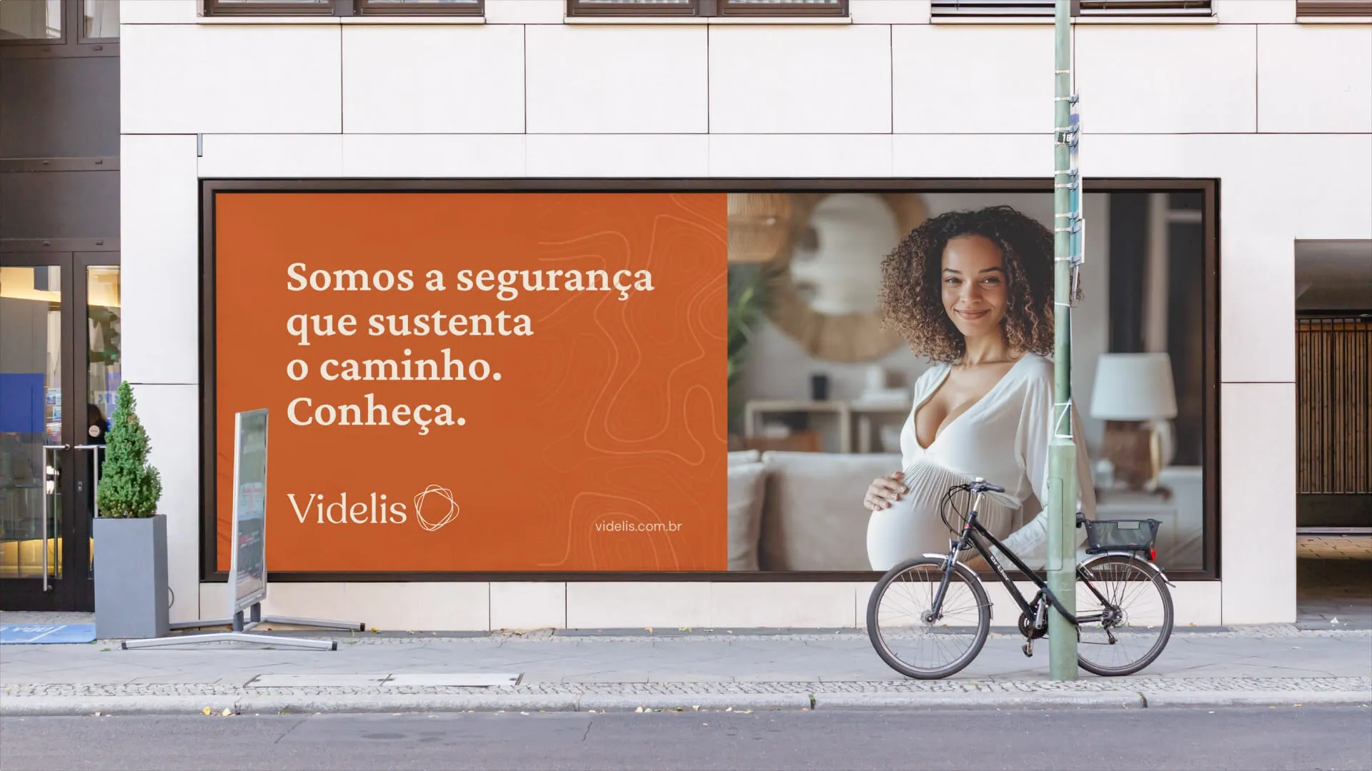
Videlis was born from the work of a physical therapist and grew into an ecosystem of care: pelvic and obstetric physical therapy, pregnancy, birth and postpartum, men’s health, breastfeeding and professional training. The challenge was to turn a personal name into an institutional brand and bring many specialties together under a single narrative. It also had to speak about intimate subjects, often surrounded by taboo, without clinical coldness or superficiality. All of this with a visual system flexible enough to support the clinic’s growth.
Concept
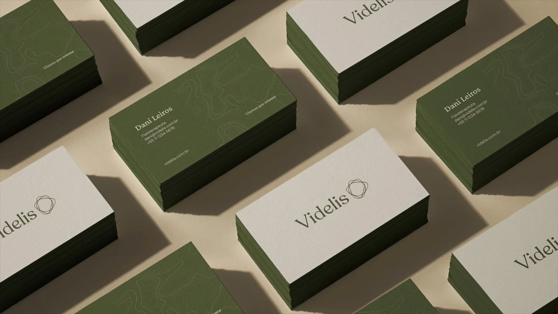
The body has layers we cannot see, and care begins by listening to them. From this idea comes topography as a metaphor: lines that map depth, flow and journey, without resorting to literal anatomical imagery. The brand sits where science meets affection. It speaks calmly, guides firmly and does not try to persuade. It leads.
Solution
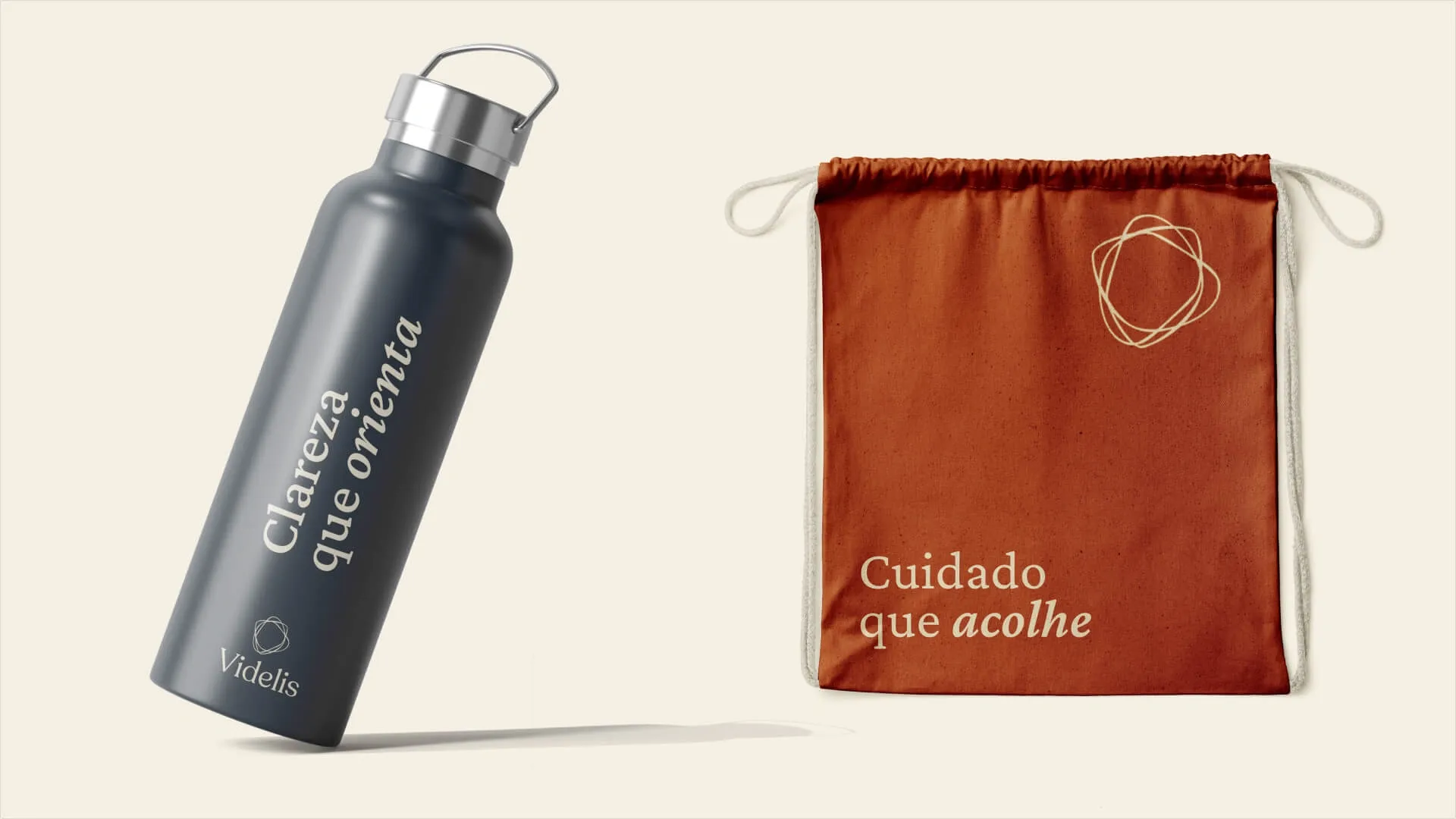
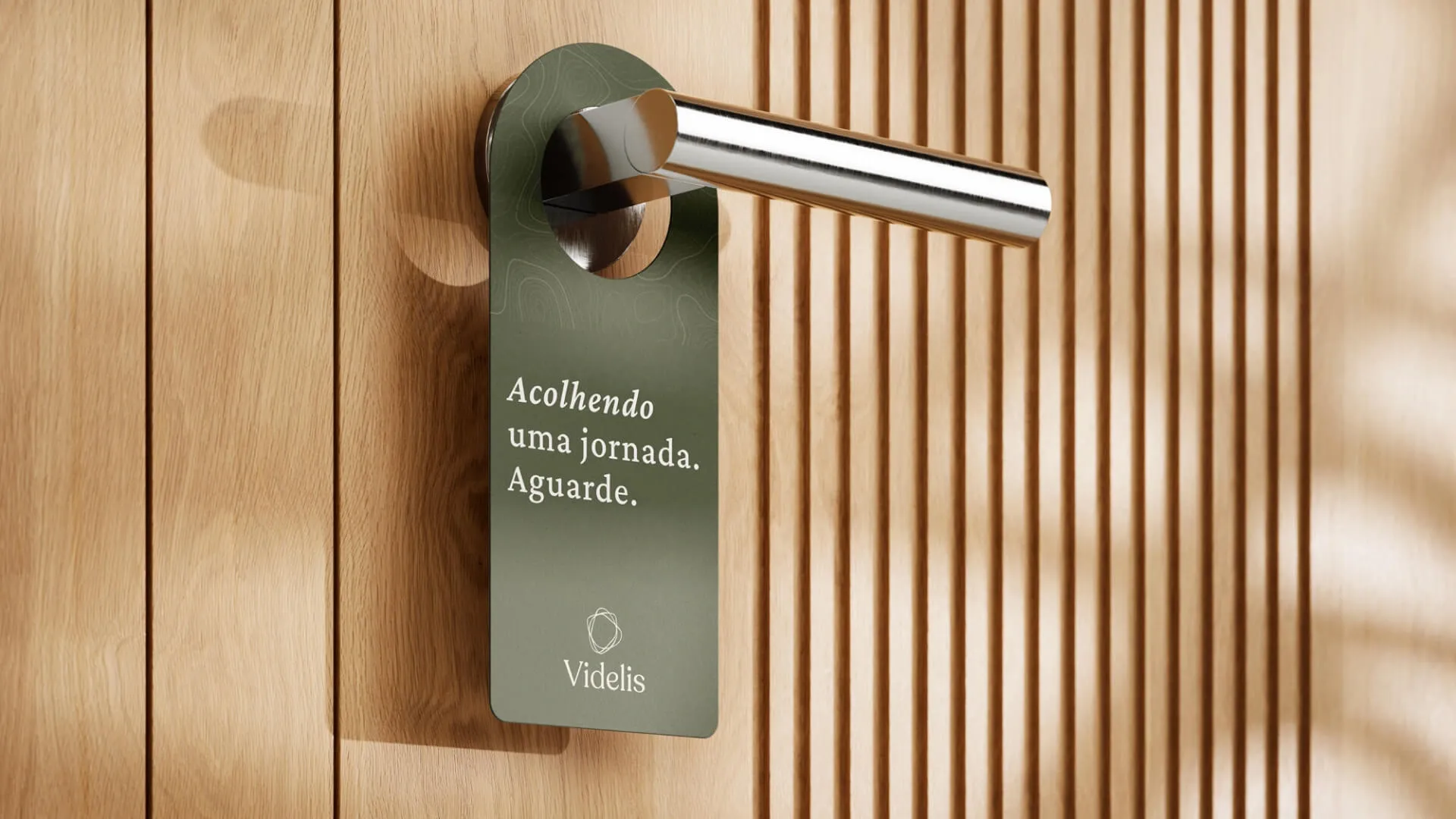
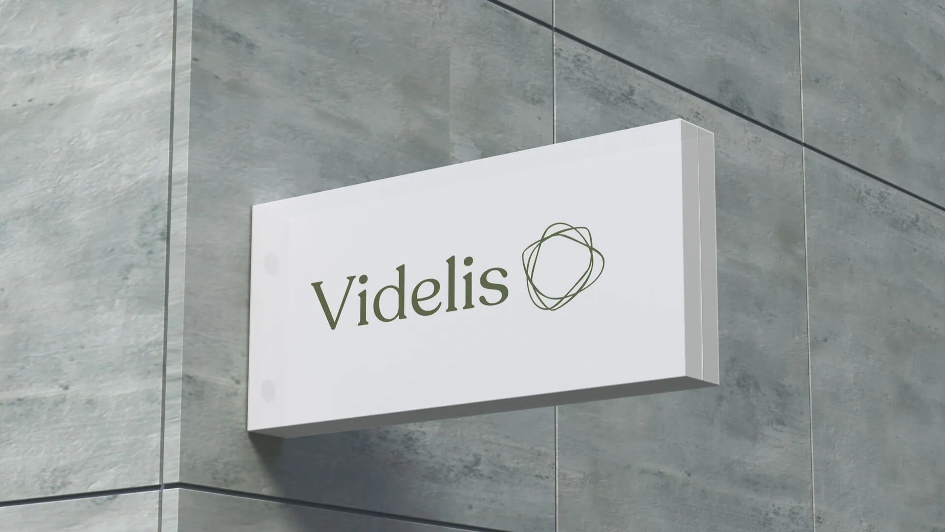
It all starts with the name. Videlis, a Latin-inspired coinage that joins the “vi” of vita, life, with an echo of fidelis, faithful, expresses a faithful commitment to life and health without tying the clinic to any single niche. Building on it, the symbol brings together organic lines that intertwine around a welcoming center. No line dominates and none walks alone, just like the clinic’s specialties. The logotype, with slightly tighter letter spacing, combines the authority of a serif with the softness of curves. Sand, moss green, terracotta and blue-gray form a quiet system, but never a neutral one.
This system was documented in a design system and carried into the website, where the same calm that defines the brand guides navigation: few decisions per screen, room to breathe and content that informs before it asks for any action.