Dra. Brunelle Bortolon
Brand identity for a practice of continuous care, built around the idea that care does not start from zero.
The challenge
The main challenge was to translate a medical model based on continuity into a brand that would not look generic, overly technical or appealing for its own sake. The identity had to express depth without complexity, authority without distance, and care without the clichés of the health sector.
There was also a context problem. The doctor practices in Ribeirão Preto but does not yet have a patient base in the city. The brand had to convey professionalism to people who do not know her, and be credible enough for the first referrals to happen.
Concept
The concept starts from a simple idea: good medicine reveals itself over time. “The doctor who stays” sums up the relationship the practice proposes: a reference physician who follows the patient for years, not for episodes of illness.
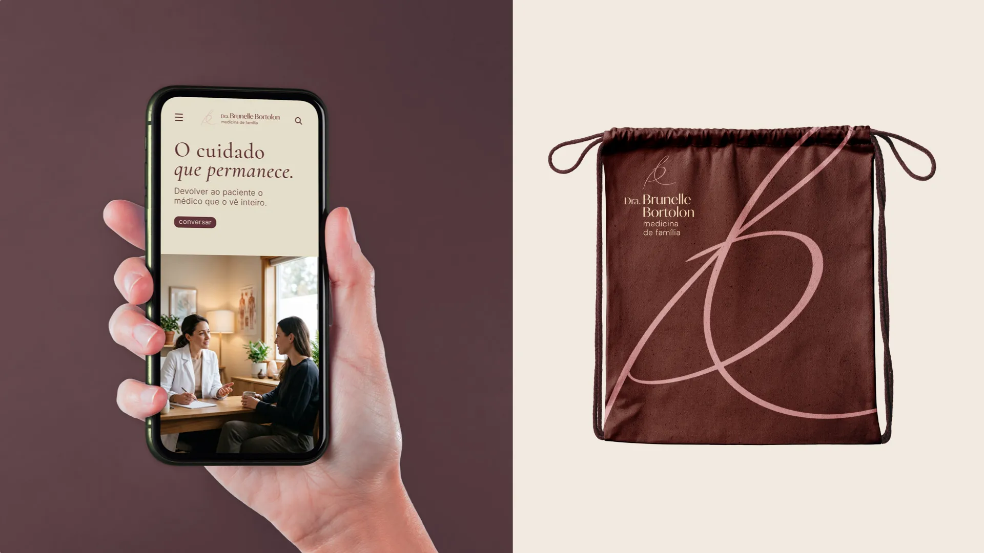
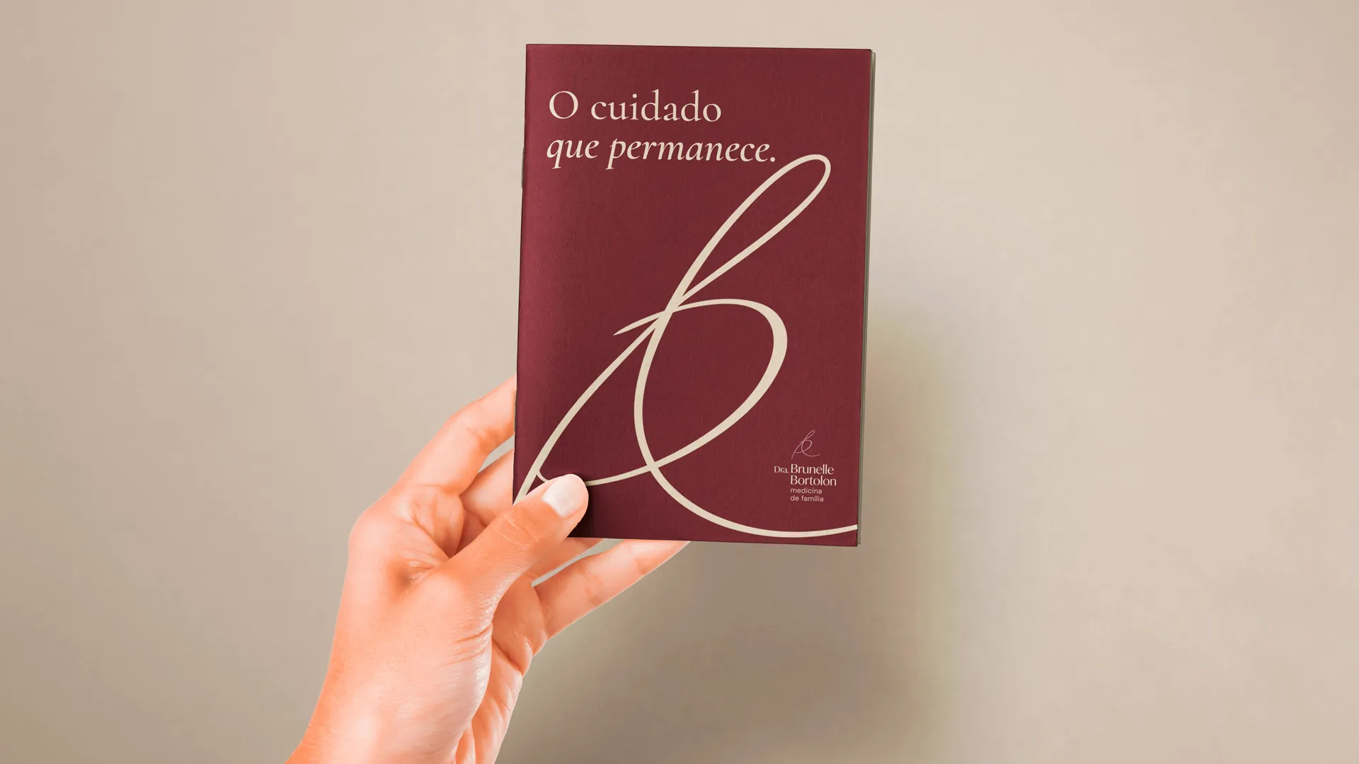
The symbol is Dr. Brunelle’s own signature, and that choice carries the concept. A signature is personal, is never repeated and answers for the person who produces it. It is the gesture of someone committing to what they write, which fits a care that is sustained over time. Because it was not designed to represent medicine, the symbol also avoids the sector’s clichés, such as crosses, leaves and hearts.
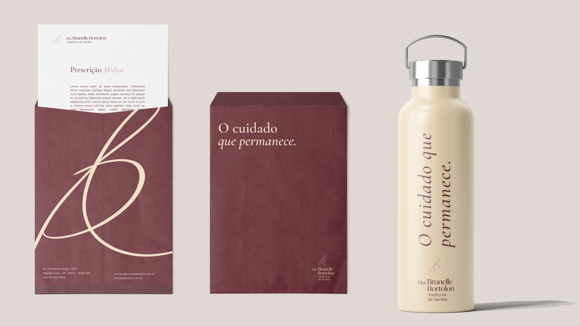
The form sustains this reading. The stroke is continuous, without interruption, and its thickness varies as it does in handwriting, which gives warmth and movement without agitation. The loops create immediate presence, and the two open ends that leave the form suggest continuity, a stroke that does not end inside its own drawing. Cropped and enlarged, the symbol works as an autonomous graphic element and creates continuity across different pieces, even when the logotype does not appear.
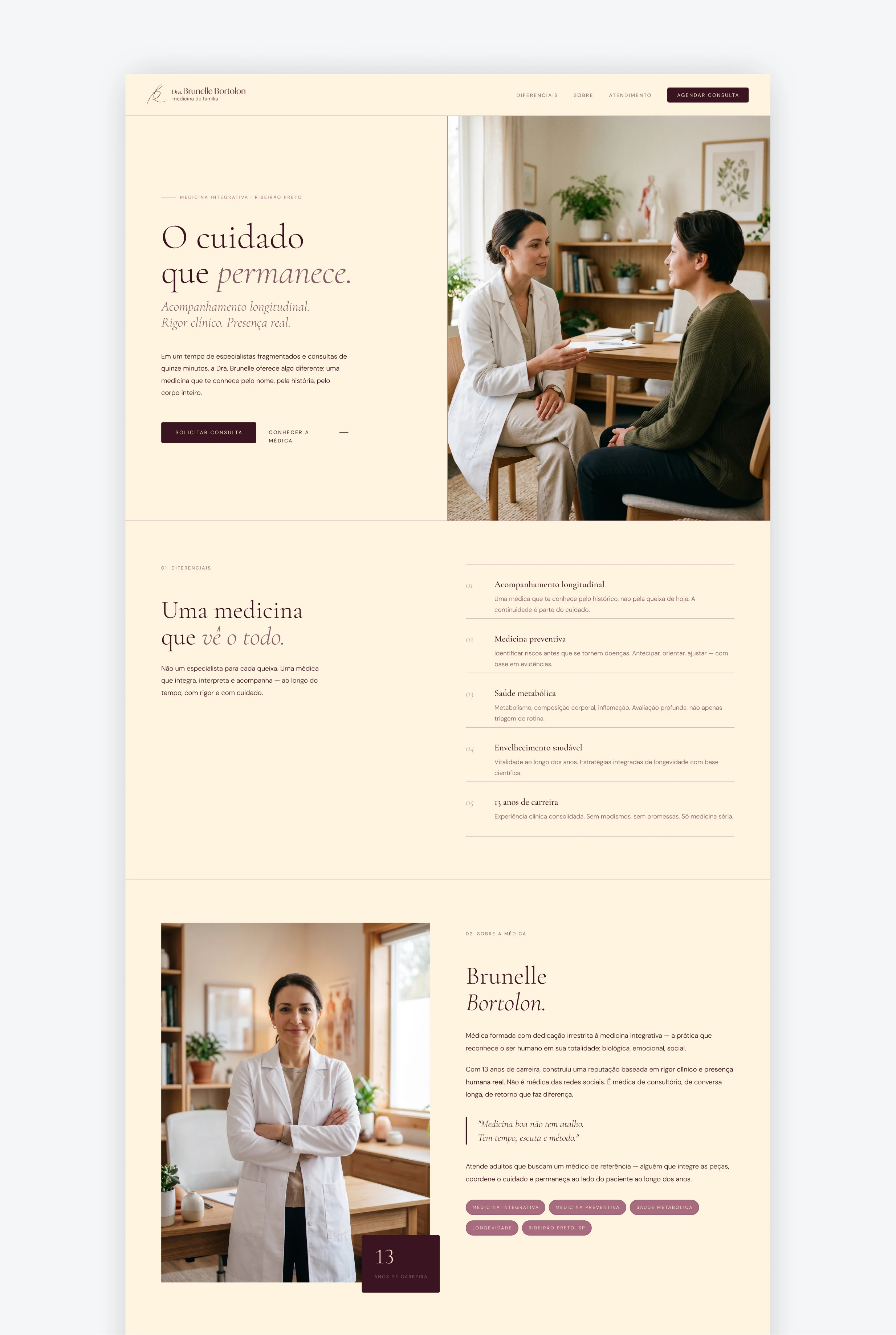
This idea guides the visual choices. The palette of warm tones, wine, brick, orange and cream, conveys warmth without saturation. The lilac enters as a temperature contrast, so the whole does not feel heavy. The titles reinforce authority and permanence, and the text keeps reading clear.
The solution
The solution is a brand system that applies the same logic as the practice to the visual identity: continuity, clarity and presence, without excess. The starting point was the strategy, which positions Dr. Brunelle Bortolon as a physician of continuous care, focused on adults aged 40 and over who want a history of integrated care.
Visually, the symbol is the physician’s own signature, which gives the brand its own identity without resorting to health icons. The logotype uses capital initials, a firmer font weight and adjusted letters to form a cohesive set. The palette of warm tones, with lilac as contrast, supports warmth without clinical heaviness. The typography pairs a serif for titles, which brings authority and permanence, with a sans-serif for text, to ensure clear reading.
Verbally, the brand speaks with calm and rejects the tone of promise: no quick transformation, no generic protocols sold as universal solutions, and no sensationalism. The application extends to the Instagram profile, the post template, the email signature and the prescription, keeping the same principle at every touchpoint.